

THERE’S MORE TO IT
Client: The Economist
Channels: DOOH/ YT/ Social/Digital/ Radio
Market: USA
Challenge: Show the uninitiated that there is more to The Economist than its name suggests.
Solution:
Using head-turning headlines we shared unexpected articles from The Economist with the widest-possible audience. We then encouraged passers-by to satisfy their curiosity by reading the full story via our digital and print channels using the line ‘there’s more to it’.
Using head-turning headlines we shared unexpected articles from The Economist with the widest-possible audience. We then encouraged passers-by to satisfy their curiosity by reading the full story via our digital and print channels using the line ‘there’s more to it’.
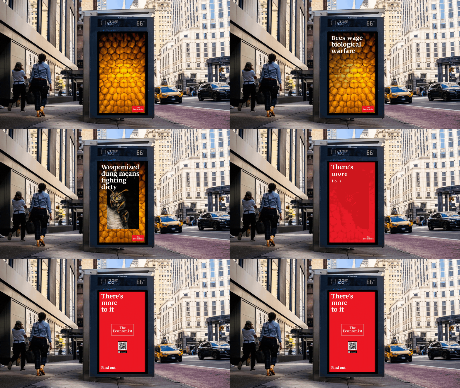
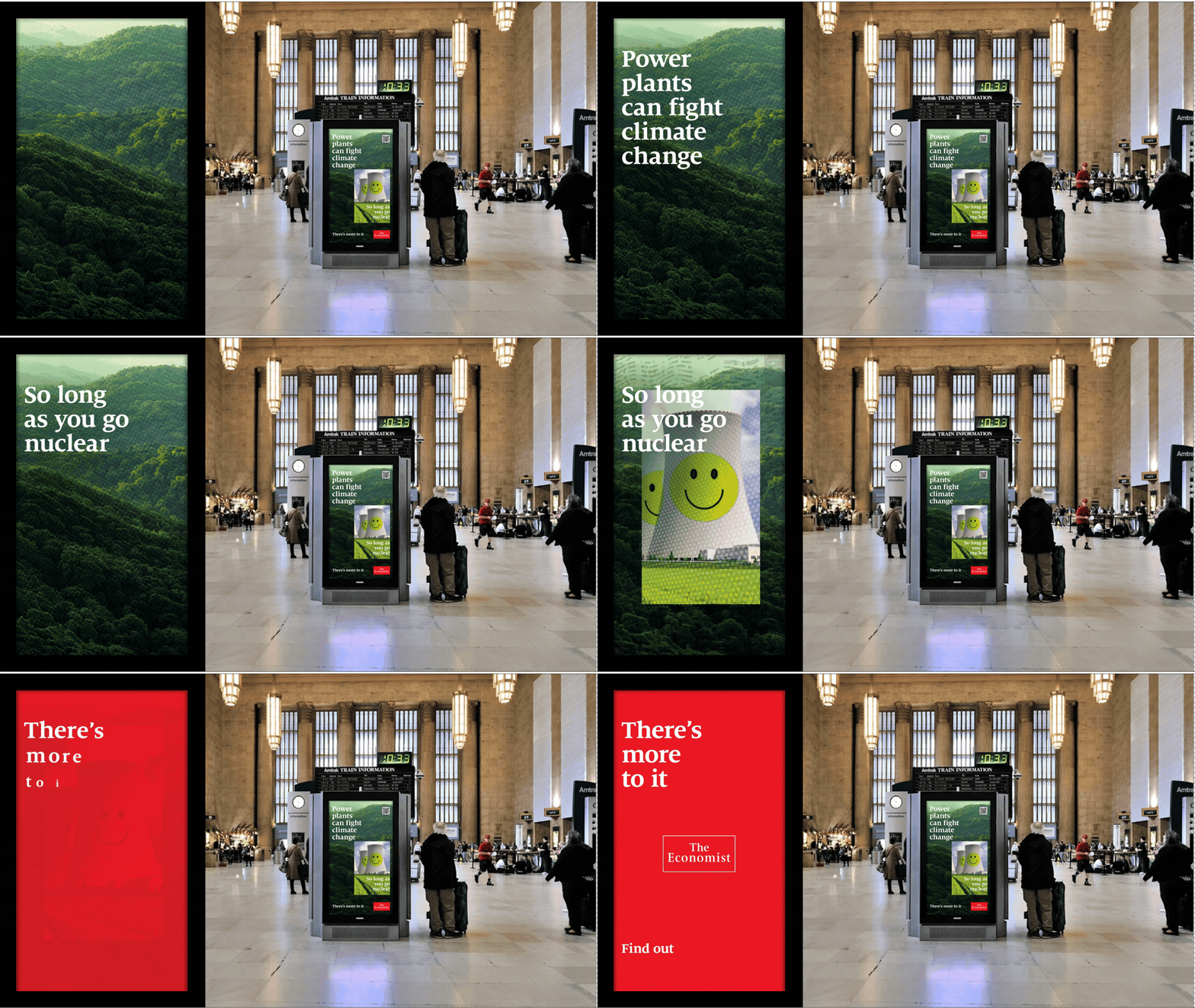
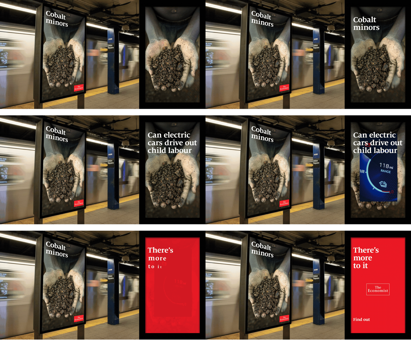
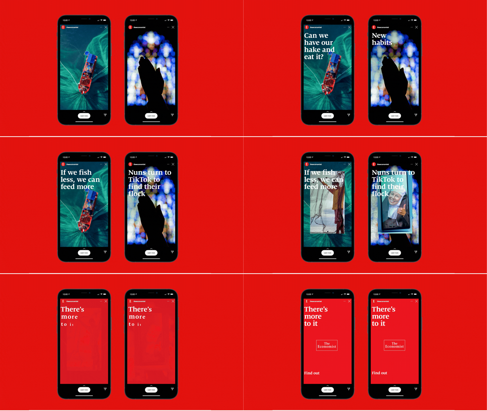
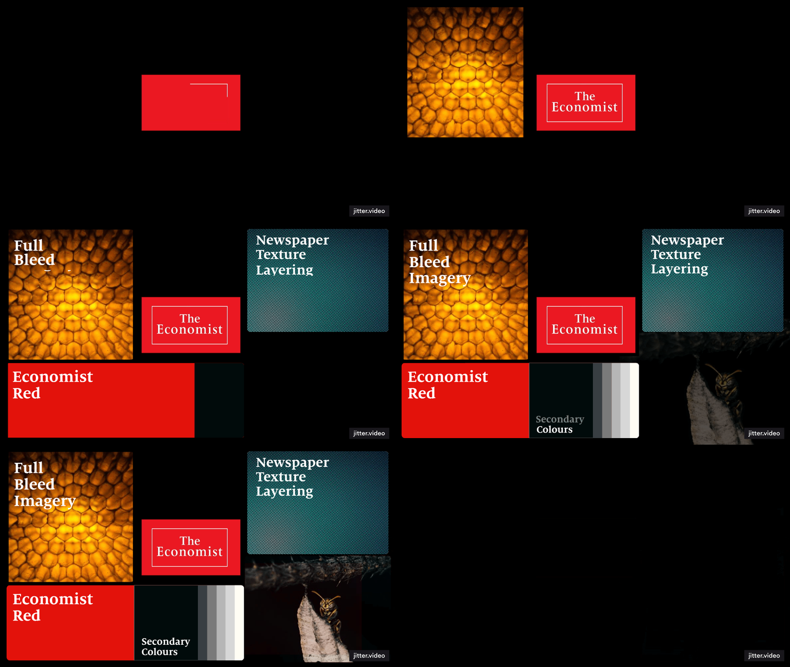
An editorial look and feel was developed using images to reflect each article and headline. A layered visual effect to represent depth and intrigue was created whilst working in harmony with the existing Economist iconic red and typeface.